
Defiance – The Story of Defying the Odds
I first met Micah via email when I sent him a note and said “Hey, have you thought about getting a better website?” At that time I was searching for Butcher Block countertops for a kitchen remodel that was a surprise for my wife while she was on a trip to visit family. I had tried to see what they had online but there was nothing but a Facebook page and some limited online content. Micah was working for someone else and said it sounded like a great idea. Push came to shove and it wasn’t the right time for them… so a site was never created.
Faster forward almost one full year. I decided I wanted the type of countertops that Micah made instead of the boring old granite that is pervasive in Arizona homes. Come to find out, Micah had set off on his own, defying the odds and in defiance of his old shop that didn’t seem like a good fit. He was ready for a change and had gone from a small cramped barn to a full fledged shop and on his way to delivering thousands of custom pieces of beautiful reclaimed wood furniture (or I would say more like art forms). Click here to see Micah’s site and place an order of your own!
A New Site to Tell the Story
Simon Sinnek said “People don’t buy what you sell, they buy why you sell it.” In Micah’s case, this is 100,000% true to the core of who he is. When you meet him you can instantly see that he is not only the real deal, he LOVES what he does. He is so proud of the work his team creates and is always keeping customers in the loop or helping them even after delivery (which was the case in my order!). The site he had before was all about the product and about showing off what they had made with limited customer interaction. The goal of this new site was to really let Defiance Hardwood’s personality show through and build in functionality that would allow them to make it interactive and informative.
Goals
- Tell the Defiance Story
- Highlight Unique Aspects of Defiance
- Engaging and Interactive Website
- Informative Design to Educate Customers
- Easily Updated and Simple for Defiance to Use
The key here was to keep it as simple as possible, yet modern and sophisticated so that the site would show the warmth of Micah’s personality and the masculine edge of an up and coming reclaimed wood furniture business.
Page Designs
Home Page
The first thing you’ll notice with the Defiance site is that all of the information you might need is at the top. From contact info to menu’s for portfolio pieces and social media, you never have to search for a topic of interest. The site has a video background that immediately engages the audience and the custom icons animate into view that tell the user exactly what Defiance has for it’s long term vision and goals. Telling the story is the first thing you see when you come to the site.
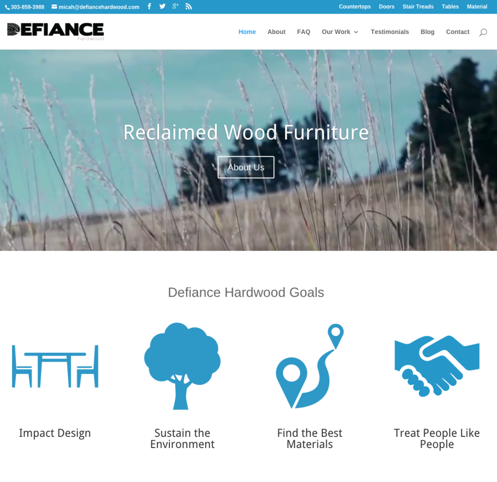
Home Page Mission
Micah lives and breathes reclaimed wood so we decided to put a video on the font page that let’s his own personality set the stage for what is to come. The Defiance Mission statement flanks the video to show website visitors that a connection to the Defiance way of doing things is much bigger than just buying a product. The images used on the site are all from Micah’s collection of shots taken from tearing down bars in Montana and from the thousands of pieces the team has produced. We took a few and made them blurred so the front objects would really POP.
The portfolio follows the Mission and video and is constantly being updated with new projects and images of items recently produced. We used the “Projects” module on the website to allow his team to add projects anytime and categorize them so they would show up on any relevant page on the site.
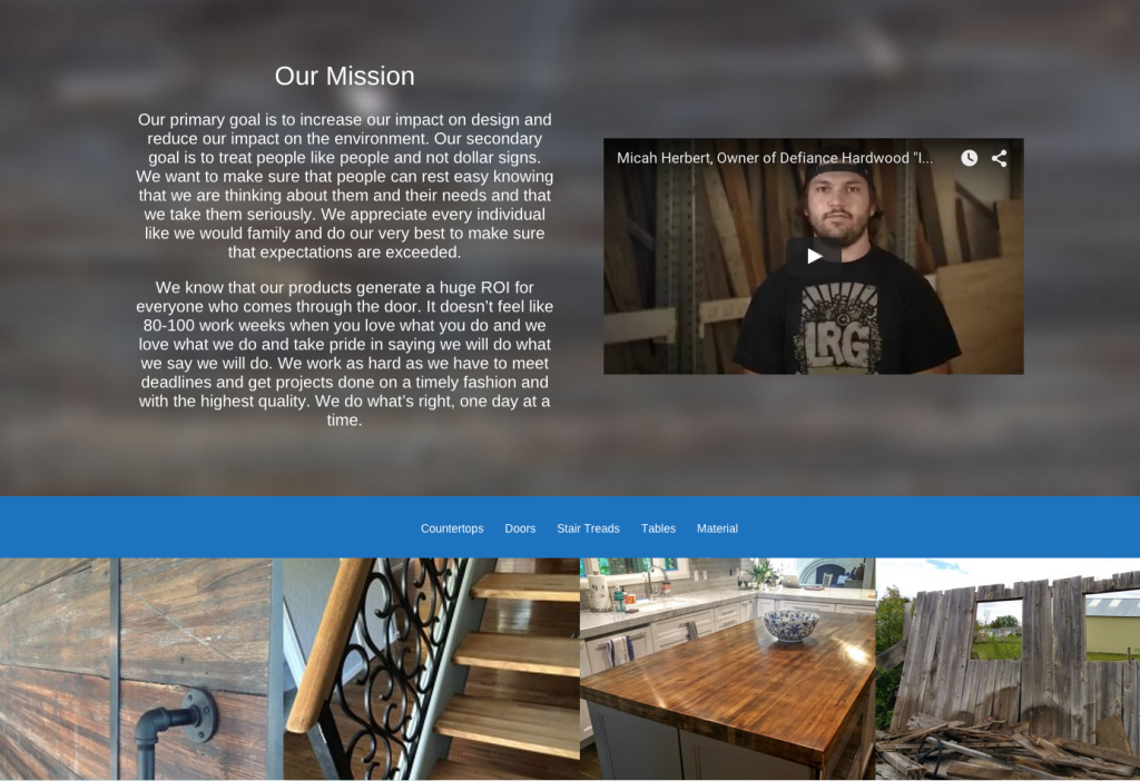
Here is a shot of the individual project page that gets create for each portfolio item. We wanted to make it simple to create a new project, so we crafted a template that provides a title for SEO purposes and then a description that can be customized and a gallery of images. The most useful piece of the site is the material, finish, edge profile and stain (not shown). From a functional perspective this lets people know what they are looking at instead of just a pretty picture. It also helps the team know what people like when they refer to the image on the site. This was a big pain for the team when fielding requests from customers who would send images from Facebook or the old site. Now everyone is on the same page.
A call to action button on every project makes sure people know how to get in touch for an order without searching and the bottom “More Examples” area is constantly updating with projects posted by the team for similar products based on the category.
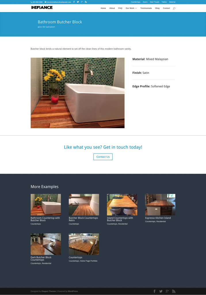
Home Page Testimonials
Micah boasts a five star rating on Houzz and the record continues so we wanted to highlight some of what his customers are saying so people can get a sense of what others are saying. For an online shopping experience this aspect is key. I whipped together a nice muted background for this section made from the Defiance logo.
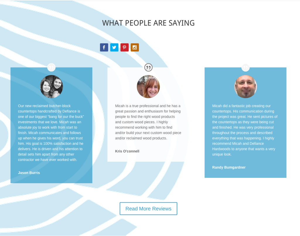
Home Page Functionality
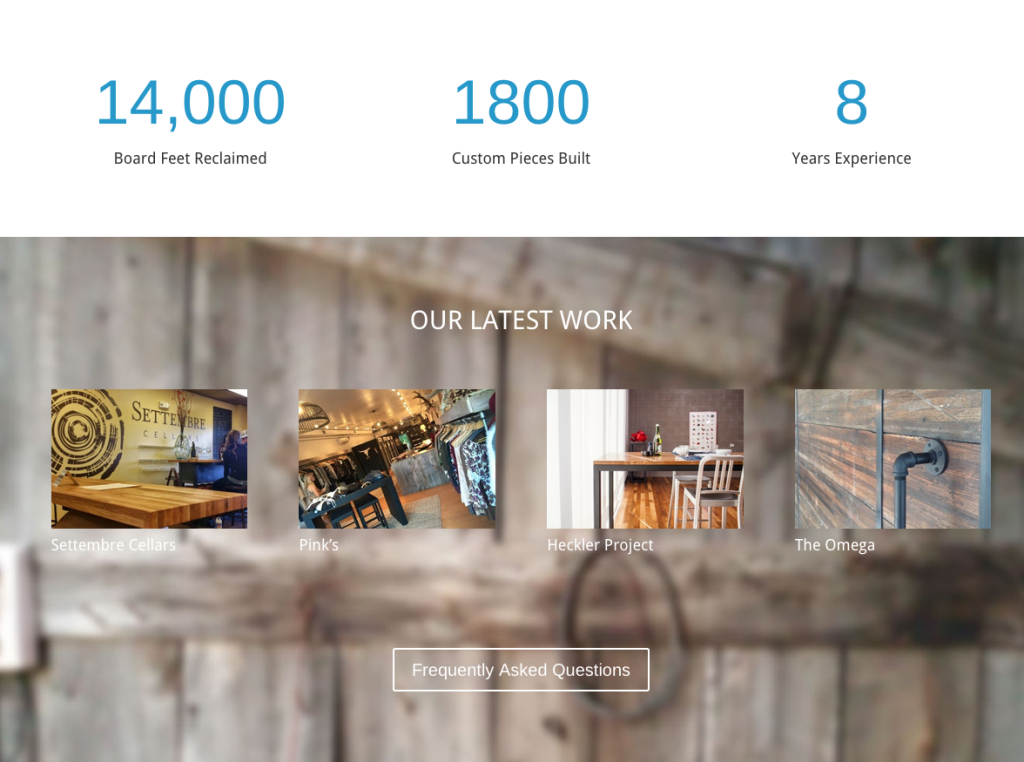
One of the functional sides of the site is the counters. Each counter shows just how much work and effort Defiance has put into their mission and the numbers can be updated by the team anytime. I think this really shows that they put their mission first and that it’s all about reclaiming and repurposing, it’s not about the dollars.
The section for latest work is based on new projects the team posts and is constantly changing with all of the newest posts appearing as soon as they are published and categorized.
Home Page Delivery
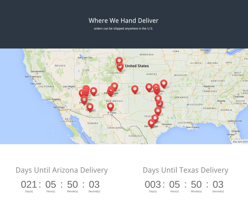
One of the things that Micah’s users constantly ask about is delivery… when and where. So we made it easy for prospects and customers to see information about the delivery routes as well as the timeframe when orders will be arriving in Arizona and Texas, Defiance’s biggest markets. The map pins and counters can be updated by Micah’s team anytime.
Home Page About the Crew
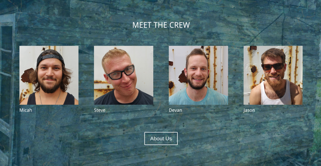
So many times you know there are great people behind the scenes, but you seldom get a view into who they are. Micah’s vision is to make a connection between the client and the master craftsman behind the day to day that will be crafting their furniture. By placing this again on the home page, the “About” section now gets a face and leads the prospect into a page where the can watch more about each person on the team. The about page also has some sweet behind the scenes views of the work in process.
FAQ Page
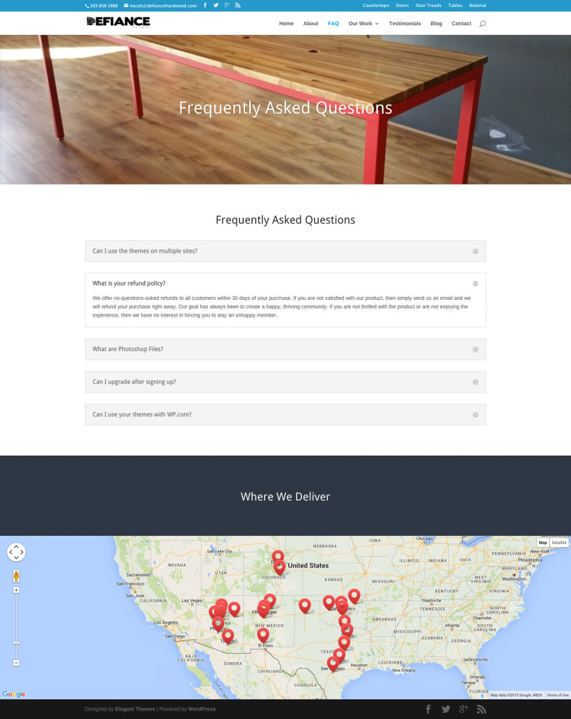
On of the things Micah mentioned is how many times clients ask the same questions. This is common for many small business owners, so instead of getting a lot of emails and calls about small questions, we planned out a page where people can get their questions answered long before the personal interaction takes place. Not only does this help customers and prospects feel happier to get information NOW, it also helps reduce the work load on the team at Defiance.
The site was a blast to build and really made the story come to life. I can’t wait to post photos of our own kitchen remodel in the coming weeks!

 I love solving problems and creating something from nothing.
November 2, 2015
Chris, well done!
Thank you
Mimi Herbert
November 2, 2015
It was a pleasure! We can’t wait to show off our own countertops as well. Micah does a great job and his passion is contagious.